A strong brand is rarely built from one sense alone. The most memorable identities combine what people see, hear, feel, and expect. In music and media, this is especially clear: a three-second audio logo can make a brand feel premium, playful, serious, rebellious, or calm before a viewer has time to read a line of copy. Color does a similar job visually. When sound and color are planned together, brand identity becomes more than decoration. It becomes a consistent experience.
Why Multisensory Branding Matters
Audio now appears in almost every part of a brand ecosystem. A track or sonic logo may be used in a streaming campaign, podcast intro, social reel, product launch, game interface, cinema ad, or short-form video. Each placement asks the same question: does the sound feel like it belongs to the visual world around it? If the answer is yes, the brand feels intentional. If not, even a polished mix can feel disconnected from the campaign.
The connection between sound and color is partly cultural and partly psychological. Deep blues and muted greens often suggest control, space, and trust, while bright reds and oranges can feel urgent, energetic, or physical. Similar associations exist in audio. A wide synth pad can feel spacious, a dry close vocal can feel intimate, a distorted bass can feel aggressive, and a soft piano with controlled reverb can feel reflective.
Turning Color Into a Sonic Brief
Color can make abstract audio direction easier to discuss. A producer can describe a track as darker, warmer, brighter, more saturated, more neutral, or more textured, and designers immediately understand the direction. In the studio, this language can guide arrangement density, EQ balance, reverb length, transient shape, and dynamic range.
A useful creative brief should answer a few practical questions before the first mix pass:
- What emotion should the audience feel in the first five seconds?
- Should the sonic palette feel analogue, digital, luxury, raw, cinematic, minimal, or playful?
- Which visual colors are core to recognition, and which are only campaign accents?
- Where will the asset appear: mobile feeds, cinema, broadcast, events, apps, or printed materials?
A Simple Mood-Matching Framework
| Brand mood | Visual cue | Audio cue |
| Premium and controlled | Low contrast, restrained palette | Clean transients, wide space, minimal arrangement |
| Energetic and youthful | Bright accents, strong contrast | Forward drums, faster edits, sharper high end |
| Intimate and human | Warm tones, natural texture | Close vocal, softer dynamics, subtle room sound |
This framework is not a set of fixed rules. Sometimes the strongest identity comes from tension: bright visuals with melancholic sound, or minimal black-and-white design with explosive percussion. The key is intention. When teams understand why a contrast exists, it feels artistic. When they do not, it feels accidental.
Keeping Digital and Print Assets Aligned

For digital-first brands, consistency becomes harder because assets move quickly between formats. A single release might require cover art, a landing page, printed flyers, short videos, thumbnails, merch, and stage visuals. Color values can shift between screens and print, just as a mix can change between headphones, phones, club systems, and broadcast compression. Tools such as Hue.ink can be helpful when teams need to translate digital colors into print-aware references while keeping the wider creative system aligned.
A Practical Workflow for Creative Teams
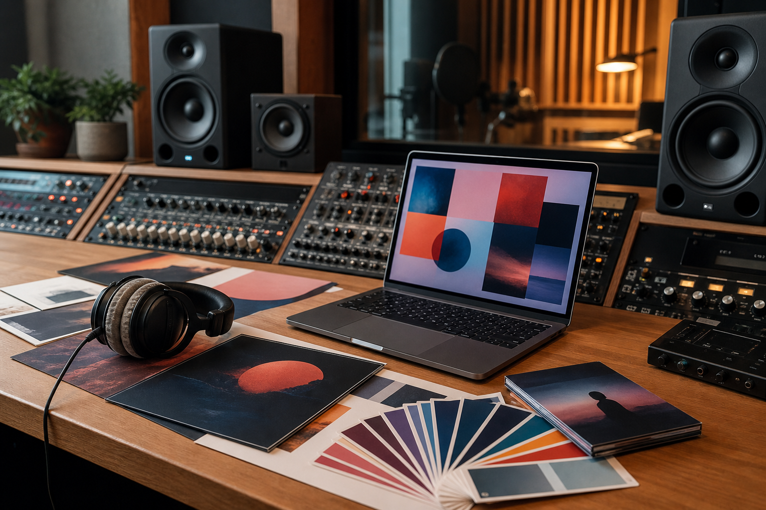
The best workflow starts with three shared documents: a sonic mood board, a visual mood board, and a short identity brief. The sonic board can include reference tracks, sound effects, voice examples, and notes on energy. The visual board can include color palettes, photography, typography, motion references, and texture. The brief should define the emotional promise in plain language, such as confident but not aggressive, futuristic but not cold, or intimate but not fragile.
From there, producers and designers can make decisions together. The producer chooses instruments and processing that fit the visual world. The designer chooses contrast, motion, and color behavior that respect the rhythm of the audio. Editors cut video to musical structure rather than simply filling time. Mastering engineers prepare versions for different platforms without losing the emotional center of the piece.
Final Thoughts
Modern brand identity is increasingly multisensory. People encounter brands in feeds, headphones, venues, apps, stores, games, and videos. The brands that stay memorable are the ones that treat every signal as part of one system. Sound gives color movement and emotional timing. Color gives sound context and recall. Together, they help a brand become something an audience can recognize before it has to explain itself.